
My current brief is to create a screen based narrative based that will function as a title sequence for a narrative of your choice.
This new brief is focused on creating an Opening Title Sequence to any film/book or it could even be my own creation!
This new brief is focused on creating an Opening Title Sequence to any film/book or it could even be my own creation!
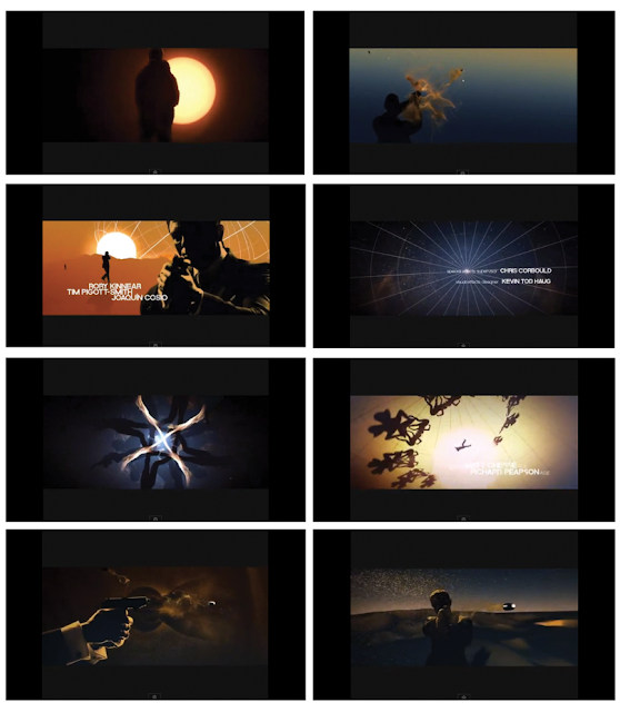
Here are some examples that have really got me inspired as Title Sequences.


James Bond - The World is not Enough (2003)


James Bond - Quantum of Solace (2009)


Sherlock Holmes (2010) Ending Credits

Se7en (1995)


Catch Me If You Can (2003)
 http://www.youtube.com/watch?v=q2Xi3ioasik&feature=fvwrel
Reservoir Dogs (1993)
I have been looking at different frames and key shots that make up Title Sequences. I would like to present my own set of frames and key shots from my Title Sequence when it is finished. I just hope that I can excite viewers into watching my Title Sequence or at least the original film.


 This image was made using 3 layers. I created the background myself, then added a version similar to the original and then pasted black paint using "paint bucket tool" to give a spilt ink effect.


Made in Motion, I think I have achieved a frustrating yet satisfying outcome with the typeface.

Reservoir Dogs (1993)
I have been looking at different frames and key shots that make up Title Sequences. I would like to present my own set of frames and key shots from my Title Sequence when it is finished. I just hope that I can excite viewers into watching my Title Sequence or at least the original film.
The Girl with the Dragon Tattoo

James Bond - Casino Royale

James Bond - Quantum of Solace

Sherlock Holmes

Catch Me If You Can

Reservoir Dogs

Experimental Effects
I know a lot of people who love the Sherlock Holmes Title Sequence, including myself. What I don't understand is why this amazing Title Sequence has been placed at the end of the film!

This is the original version and style of the Sherlock Holmes Title Sequence.

Statement of Intent
For this project I am aiming to produce a remake of the Title Sequence "I Am Legend" as I feel the original could have been so much more. I want my Sequence to excite the audience into watching the film and fill them with suspense for what is to come.
Before deciding on "I Am Legend" I had a few different ideas that I was still choosing between. Mainly creating a longer Sequence but within Maidstone high streets for "I Am Legend" or creating a more improved version of "The Shining". With "The Shining" I felt that it looked a bit novice and could have been handled in different ways, especially with the typefaces and credits. However, I planned to keep the original music from "The Shining" as I don't think you could improve on it. If anything that is whats makes that particular Sequence memorable. At the time I wanted to see if I could achieve producing a horror/thriller genre Title Sequence and filling my viewing audience with not necessarily fear but suspense. In the end I abandoned the idea for "The Shining".
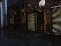
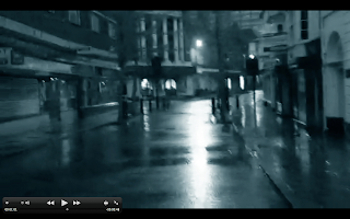
The main concept that excited me the most was gathering film footage from a desolate and abandoned city, or in Maidstone's case a town where the populace would not be around during filming. This meant I would have to gather the footage in the early hours of the morning.
I gathered my footage on a rainy morning between 4.00am to 6.00am.


These pictures were taken within the last few shots that were filmed. I think this was the perfect location to film the ending of my Title Sequence because of the tall buildings that surrounded the camera angle and the darkness just added to the effects and feeling of the whole shot.
My Title Sequence in Frames
The following frames are the main frames of my Title Sequence "I Am Legend (Maidstone rendition)". I wanted the audience to get the feeling of not being followed, but on the lookout for danger and as in the original film "Darkseekers". That is why I felt it best to not have the film anymore "jumpy" than it already is, but to cut round corners sharply and have the Titles come into the Sequence quickly and unexpectedly. Thus having the appearance of a horror/thriller genre and hopefully, achieving suspense and an anticipated vibe. It was recommended to me to gather footage before piecing together a storyboard, which was best because I knew how I wanted my film to be but more experimentation would be required. So I plan to use these screenshots as a storyboard and I will put my Sequence together from these.


Below is the original I Am Legend typeface. In the film it cuts to the font and slowly zooms in on it. However with my version I wanted to have a nervous and scared feeling given.
Made in Motion, I think I have achieved a frustrating yet satisfying outcome with the typeface.
This short film was produced as an experiment with small amounts of footage to see if it was possible to create a horror sort of ambience and keep the viewing audience in suspense.
The Final Outcome as a Title Sequence
I am ecstatic with my final outcome. I decided not to make the film itself too jumpy as to not frustrate the audience with the footage constantly being pushed into their faces. I also wanted the audience to get a sense of danger and suspense and wanting them to be enticed into watching the actual film if they have not already seen it for themselves.


